The Autosaviour: How The Illustration Was Constructed
Autosaviour Pro v2 is a plugin from Astute Graphics and recently I put together the training videos for using it; an image was needed to make the videos more attractive (who wants to look at a blank document while they learn?) and so The Autosaviour was created.
It's a very simple illustration in many ways but does use some nifty techniques that you may find useful yourself so sharing them seems like a good idea.
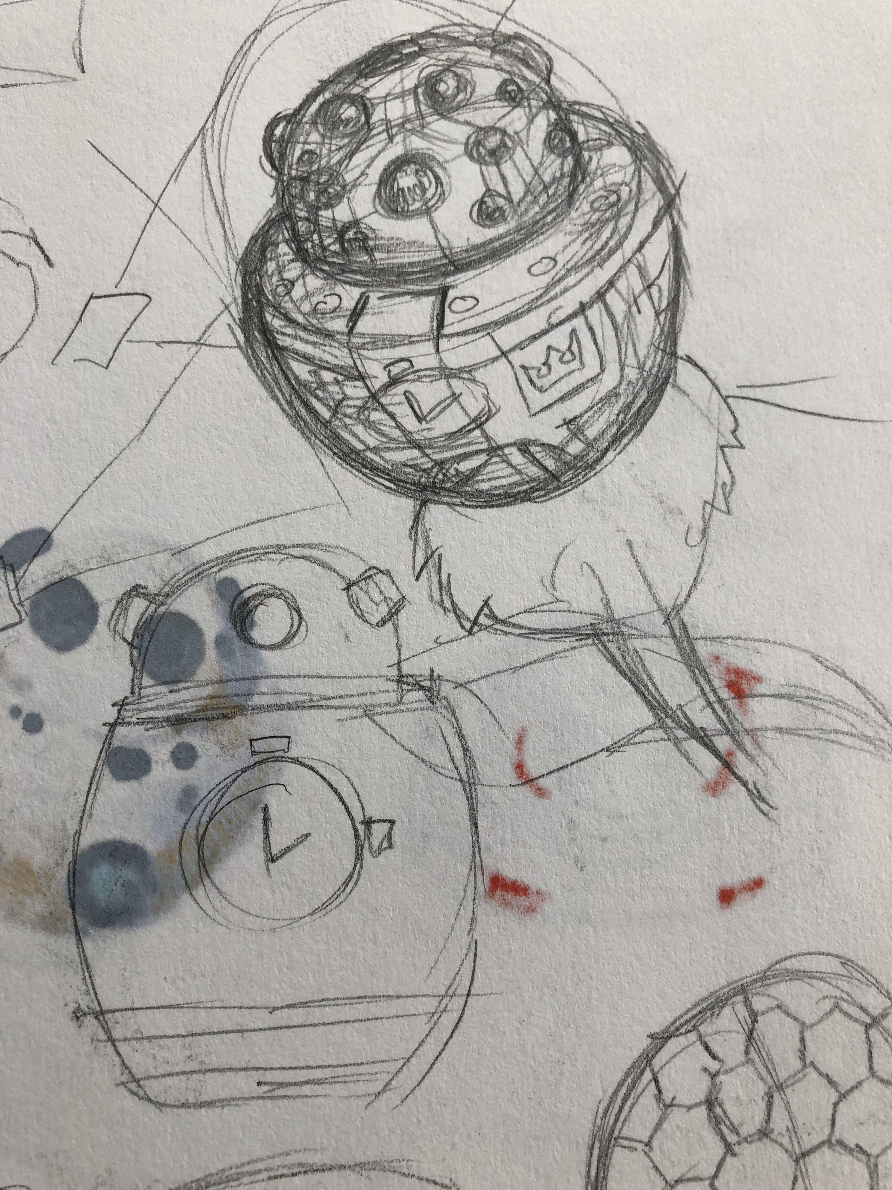
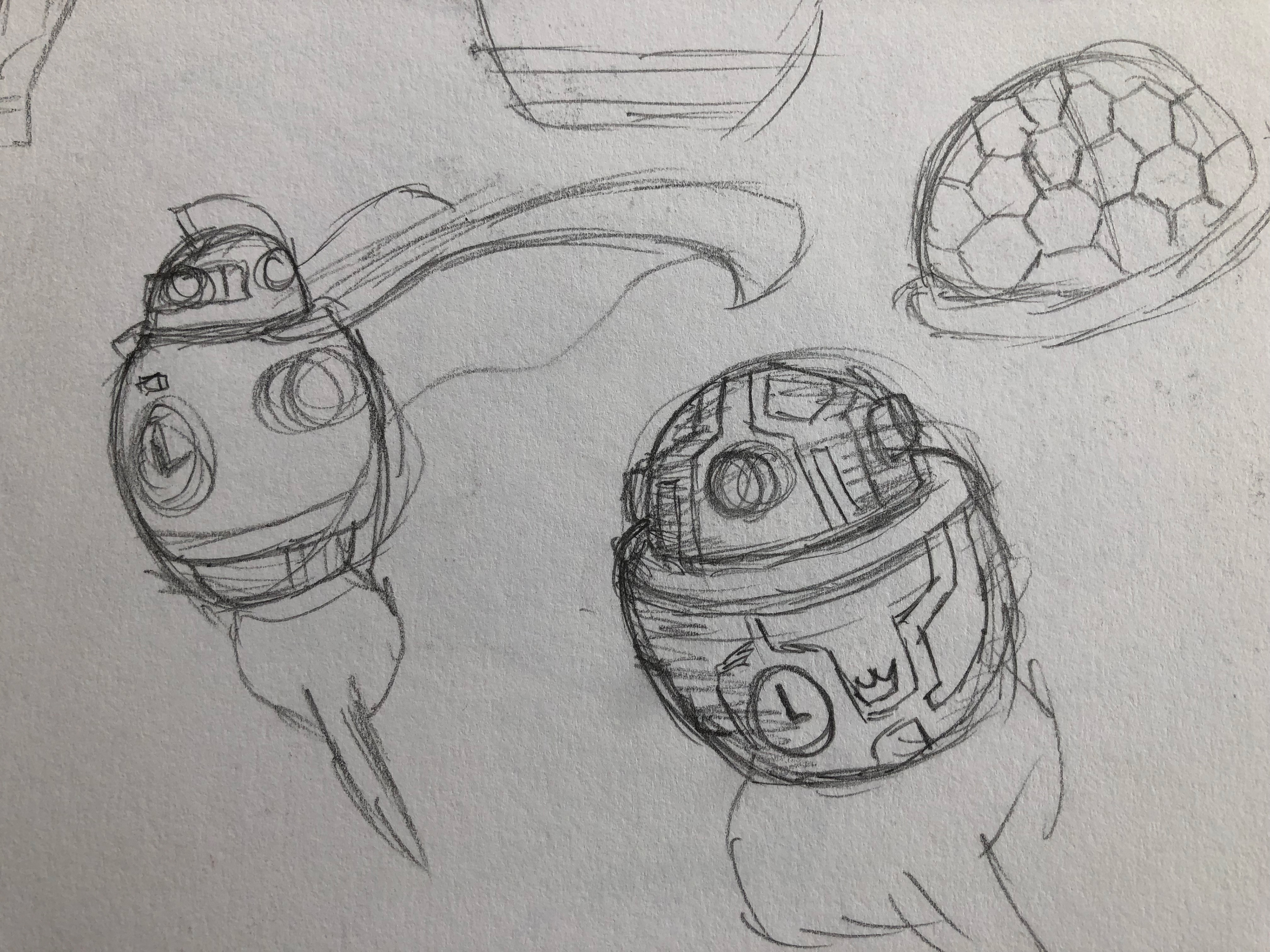
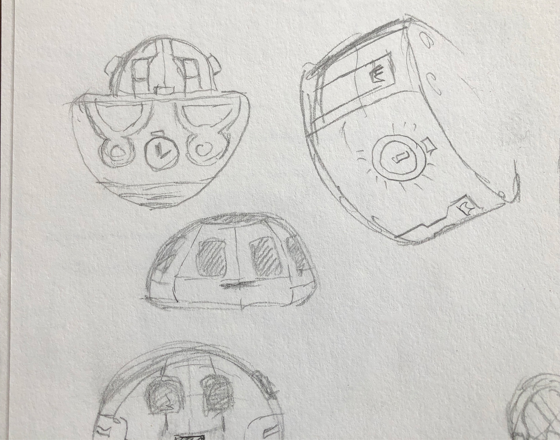
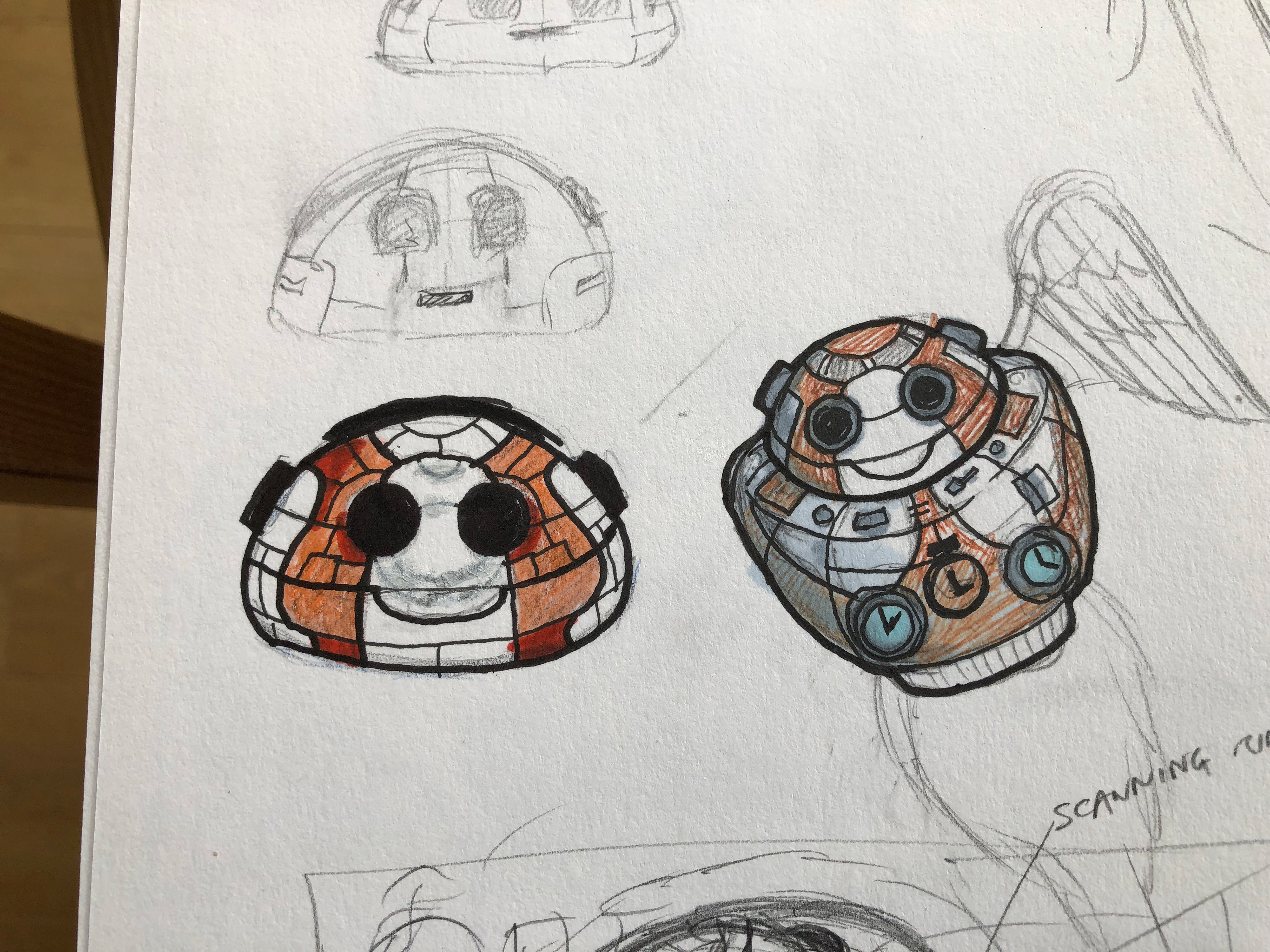
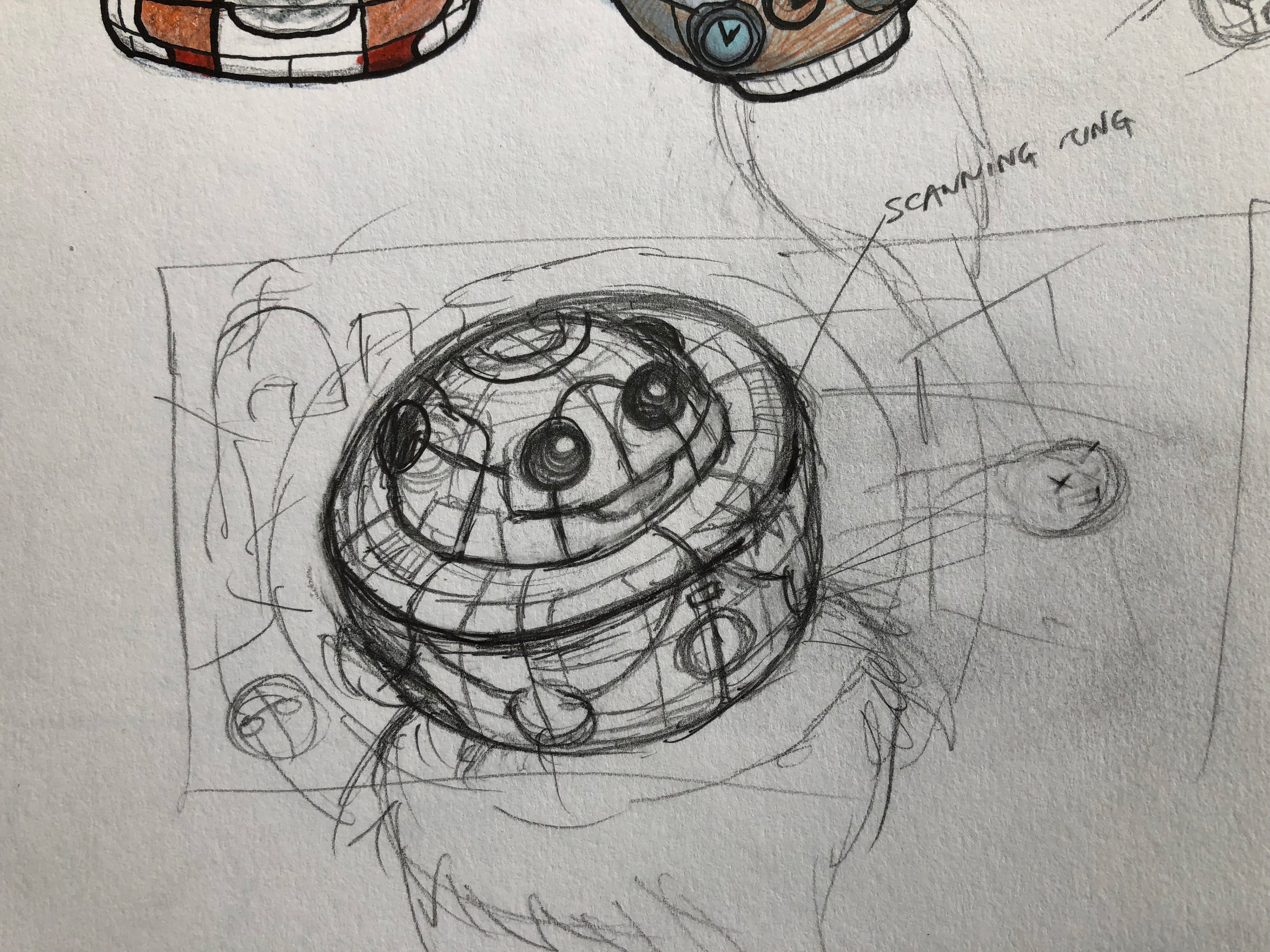
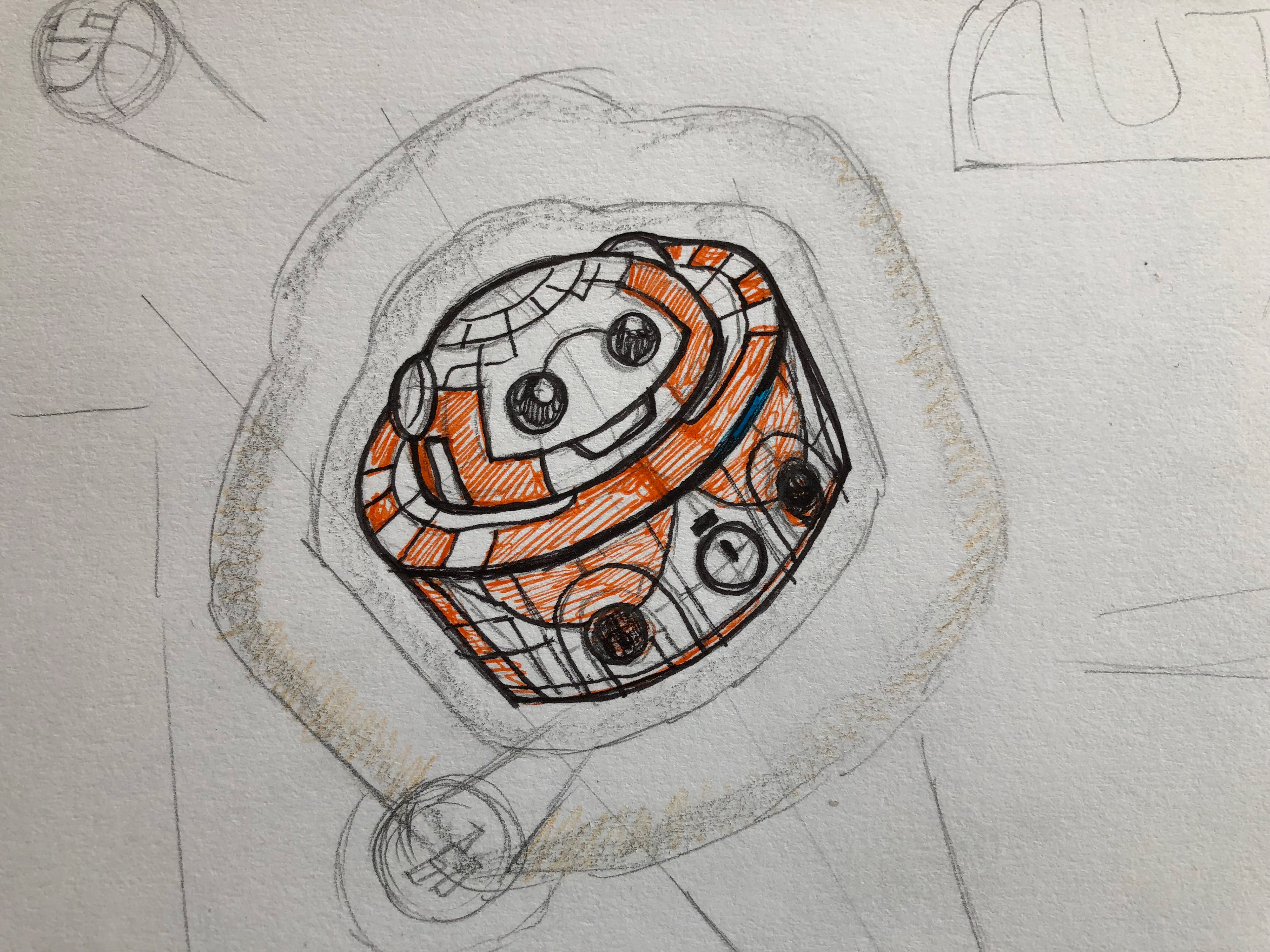
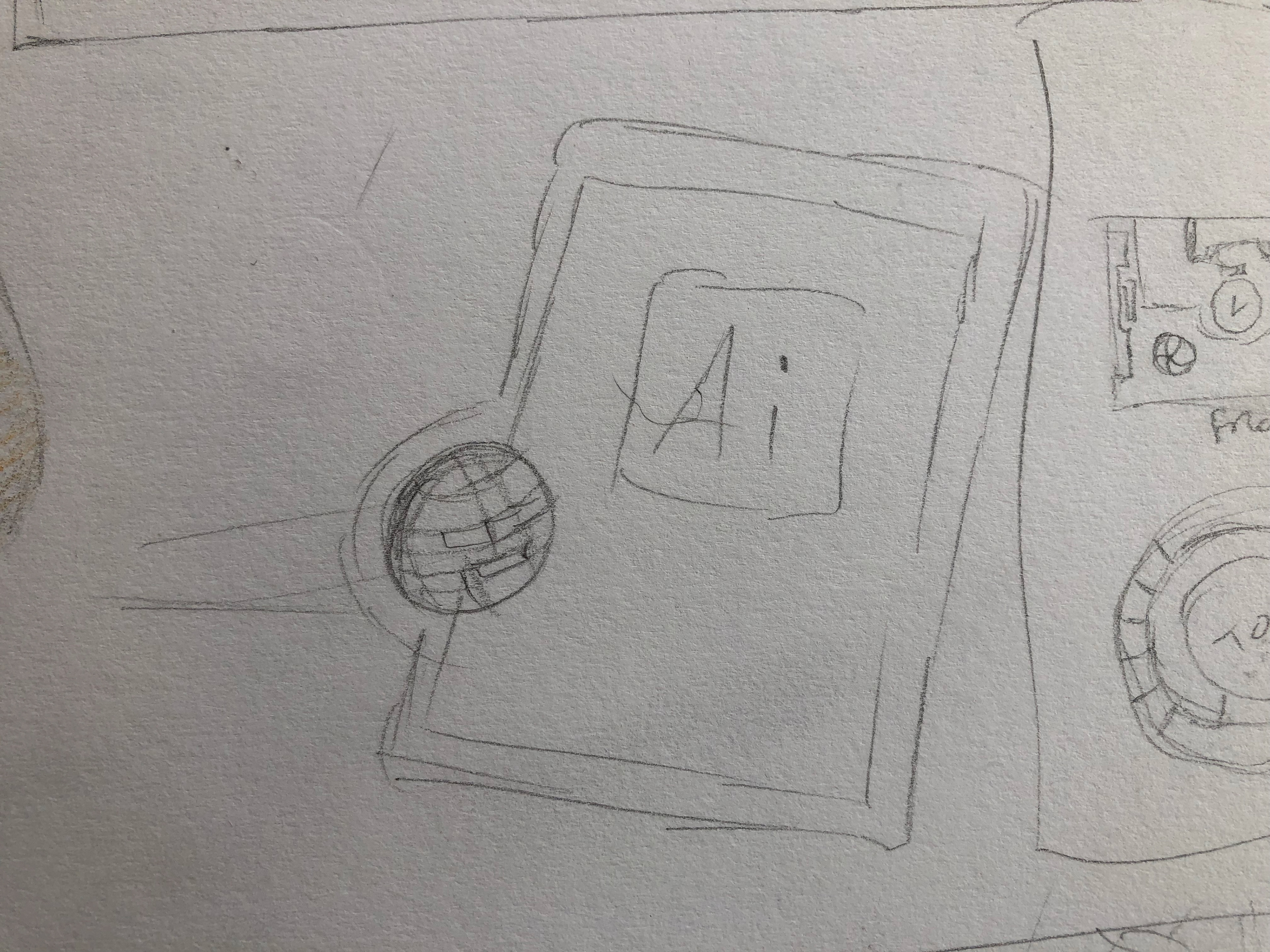
Like any other project, this began with lots of scribbling in the sketchbook, and on this occasion I stuck to analog sketches. I worked through a number of ideas, a few of which are in the first two images below and decided early on that The Autosaviour should be some kind of automaton. There were a lot more sketches and these are neither the best (and definitely not the worst) of them but as I frequently take calls while I'm working many of them end up covered in notes and phone numbers, which I wasn't going to 'shop out for this post.
You can see that one of the versions had a cape—to show Autosaviour as being a hero—but I moved on to something that had more in common with R2D2 fairly quickly. In the third image you can see where the Astute Graphics crown was first considered in the body texture and that continued through a number of sketches until I realised that it seemed like The Autosaviour had developed "droopy chest anatomy", so that got binned.
Also in the sketches the idea of small bots (deployed from the body) appear but on reflection these seemed like a redundant mechanical symbol that wouldn't reflect the power of The Autosaviour, who would of course only need to be aware of the documents to protect them.
The Character
Once a fairly solid approach had been established, then the process of building The Autosaviour started. The approach for this was based on a group consisting of a quarter-circle for the dome and a rectangle with rounded corners on the outside for the body. It is worth noting here that although the image below shows those shapes as having a default appearance, this is just for illustrative purposes in this post, and the actual shapes just had an orange fill—you don't usually want strokes when you're using the 3D effects, which was going to do the "heavy lifting" in creating the character.
So with the shapes grouped (mentioning that again as it is important) the 3D Revolve effect was used to turn the shapes into the dome and body-drum, as you can see below. What I wanted to do here was to build the texture "flat" and apply it using the Map Art feature in the effect dialog.
My approach to doing this takes a few steps, starting with establishing the desired position, then opening the Map Art dialog and navigate to the surfaces that I intend to map. What I do next is create a screen-grab of each mapping grid in the Map Art dialog and save them out to image files; Snapz-Pro is my preferred app for doing this as I can determine a region and scale for the image then save it to a specific location, without leaving the dialog.
The images get placed into a new Illustrator document and the layer that they are on gets turned into a template layer, so that the images are dimmed and I then work on a new drawing layer (or layers) above them. The only one missing from the set above and below is the top of the body-drum—and as that was a circle, didn't use a map-grid for it.
Once the art is done, then it is turned into individual symbols for the dome, the body-drum top, curved-top-edge and main cylinder, and pasted into the main document. It can be deleted as soon as pasted—a copy is automatically added to the Symbols Panel and that's where it needs to be for mapping, as you can see below.
Don't forget to pay attention to the lighting options in the More Options… section of the 3D Revolve dialog in your own projects as it can sometimes make-or-break the appearance of the effect, as can the number of blend steps (but expect the screen-rendering time to go up, too).
The Background
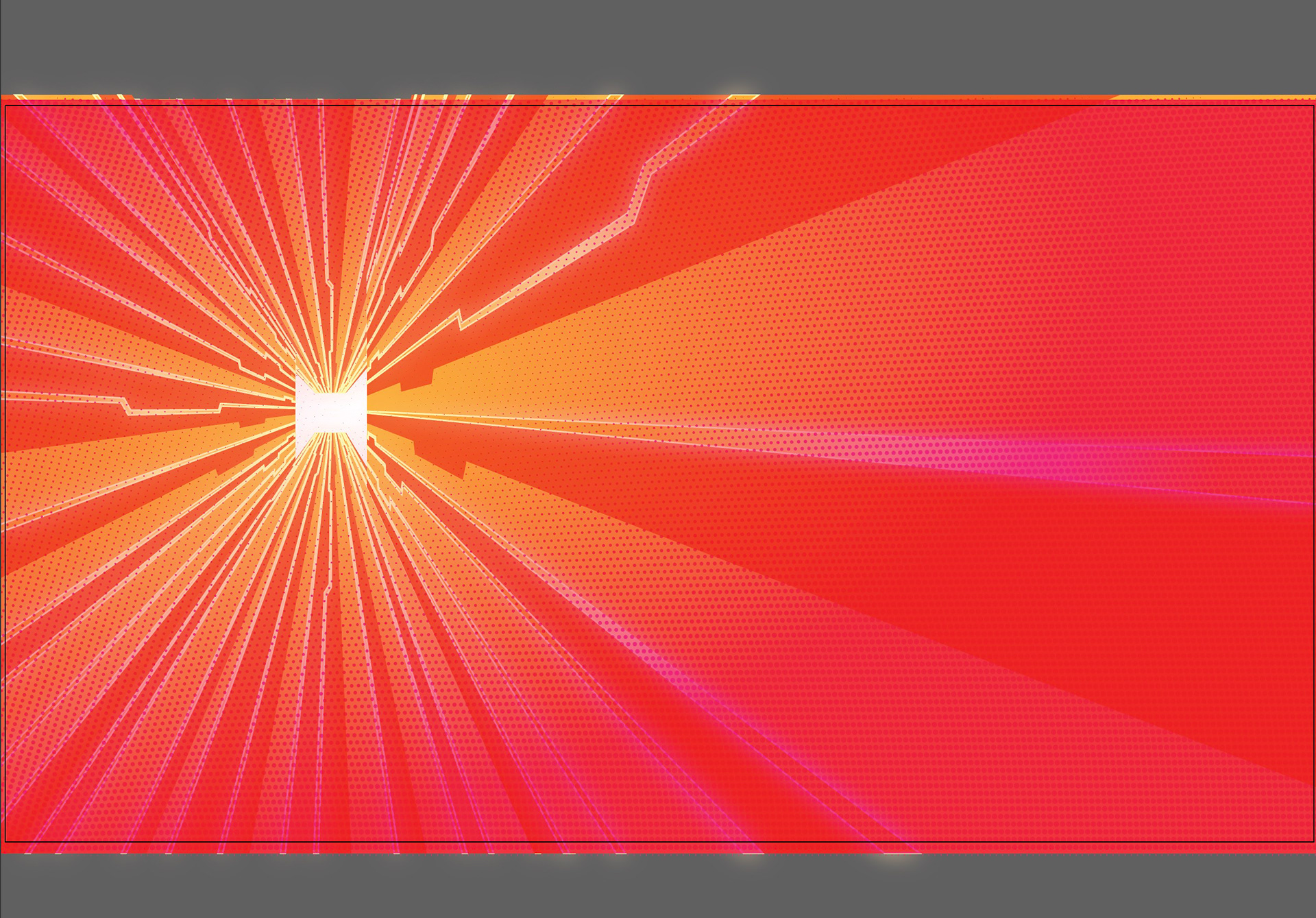
The background was built very quickly, and used a one-point perspective grid with a vanishing point that would be directly behind The Autosaviour.
The simple "circuit-board" art was built in another document, then pasted onto the planes, using the Perspective Selection Tool and the move perpendicular modifier (5) with the alt/opt key to duplicate—it's the "widest" shortcut I know in Illustrator, holding down alt and 5 while dragging, but it does help to improve your piano-playing :D.
Now to "unflatten" the background and in a new layer (organisation is key) added a rectangle with a radial gradient fill, from transparent pink to fully-opaque pink. The shape was blended to 85% opacity using the Darken blending mode.
That rectangle was then duplicated…
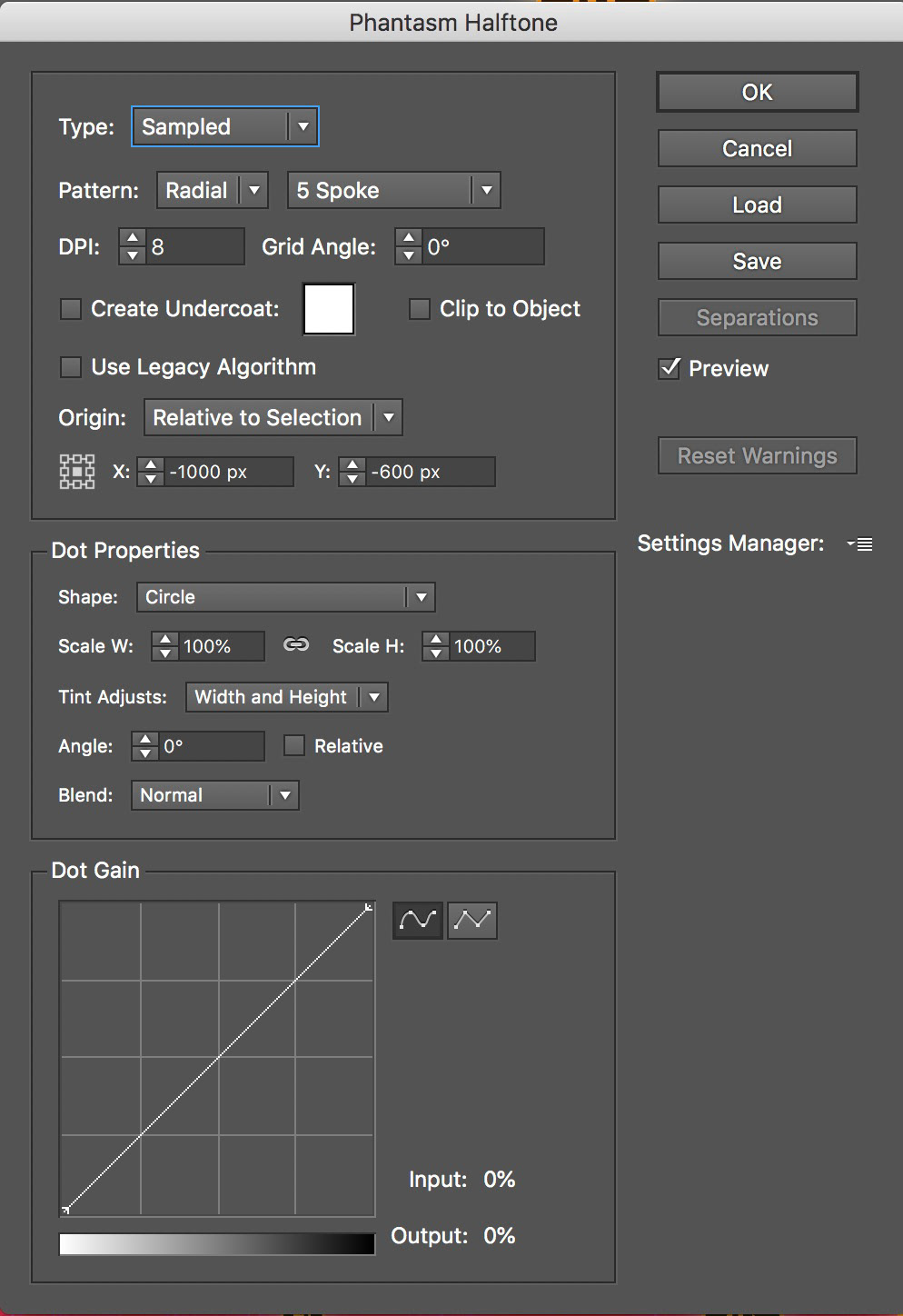
… and then modified using Astute Graphics' Phantasm plugin to apply a radial halftone effect.
I love Phantasm—it stops me from doing what a lot of others have to do, and that is take your lovely super-editable vector illustration into Photoshop, which means that in all likelihood your workflow then becomes disconnected.
You can see from this screenshot that Phantasm Halftone (there are other Phantasm effects) way exceeds what you can do even in Photoshop.
Next step was to add another new layer and then to recall the perspective grid to duty; by swinging the vertical plane of the grid and duplicating the Illustrator document icon it was very quick and relatively easy to build out the constant stream of documents "into the system" that The Autosaviour would protect, and an outer-glow effect added to the layer was automatically inherited by each instance and gave the impression of them being "shielded".
Refining
Time to turn on the layer containing The Autosaviour and then to add a few refinements. It's at this point that the Illustrator "large document warning" kicks in and the native document recovery gets switched off but luckily I have Autosaviour enabled for the document and it is keeping six backup copies for me, too. :)
The Autosaviour needs to show it is fully energised so I duplicate it, remove the mapping and shading then expand the effect and optimise it so I just have the shape. Using the Offset Path effect to make it slightly larger, an Inner Glow effect is added to that…
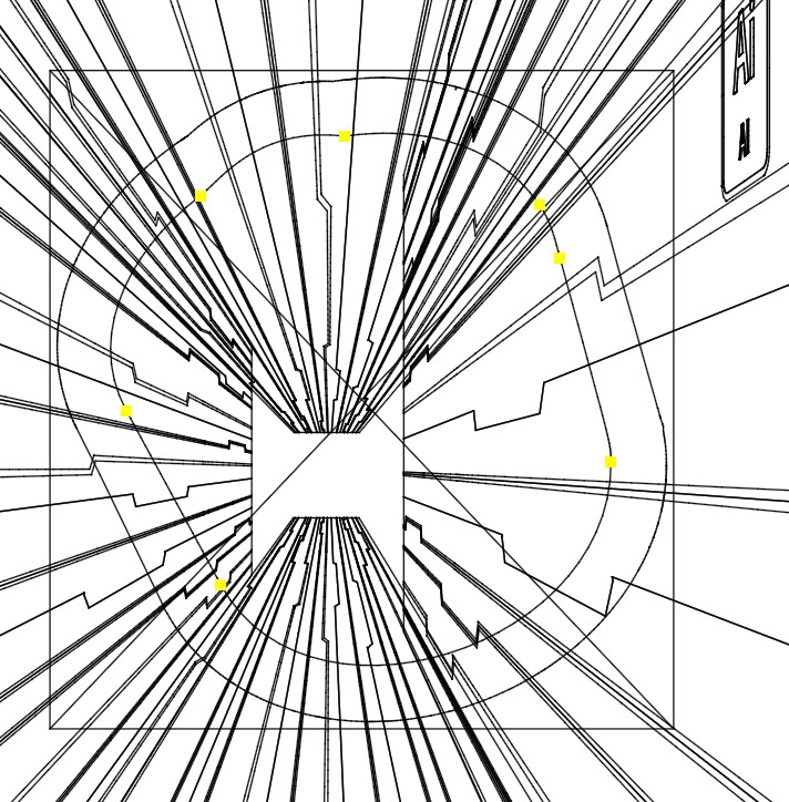
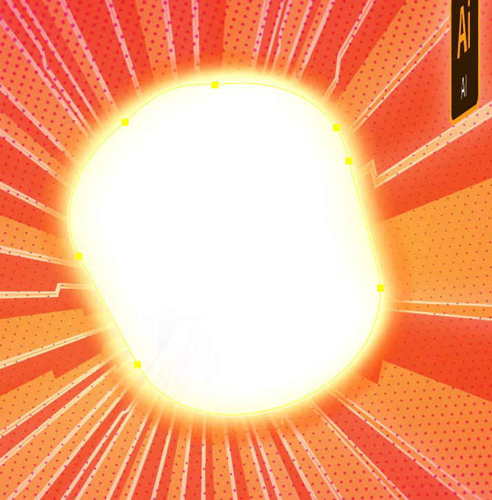
… and that is moved to a sub-layer beneath The Autosaviour.
To add some motion, a 300pt stroke is added beneath and a width profile (default set, profile 4) applied to that, then a gradient applied to the stroke from white at 100% opacity to white at 0% opacity, finished off with a feather effect to soften the edges.
Finally the shape used earlier for the glow is reused (without the offset path effect) and another inner glow that unifies the first glow with the character.
The final asset is now ready for use in the course and the artboard is exported for the video thumbnails and blog posts. Hope you've enjoyed learning about how it was made—if you'd like to see more on how I make some of the assets I use on my courses for LinkedIn learning, Lynda.com and Astute Graphics, then please let me know in the comments.